Design Matters: A Method Thang
February 22nd, 2011 by clifEvery so often we like to highlight a simple fact: design matters.
There are so many reasons for this. One of our favorites is that design is a great equalizer. It gives small companies a chance to compete with the big boys. Apple may be the best example. Currently the largest company by market cap in the the world, it wasn’t always that way. For decades, Apple represented a minor player in the world of computers next to PC manufacturers like Dell and IBM. But they hewed to a belief that design mattered and eventually they were proven right. Now everybody in the market chases them.
Great design endures, while technology is ever changing. So how does one maintain consistent and effective messaging across all these evolving platforms? By having a brand that is distinctive, memorable and implemented effectively.
Think of Campbell’s Soup, Nike and Coca-Cola — you instantly picture their logo. That’s great design. You can’t place a value on it in terms of ROI, because it represents the essence of the brand. What’s that worth? Coca-Cola may have changed their formula at one clay footed moment in time, but they have never changed their logo.
Great design endures because great design works.
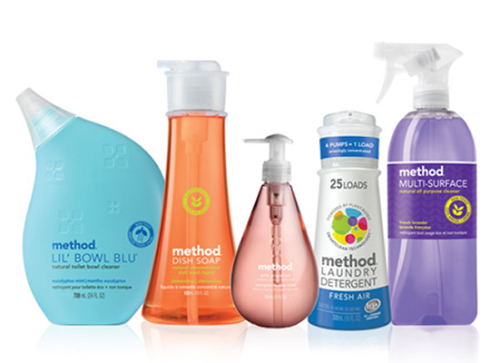
The people at Method, a home cleaning products upstart, are taking on worldwide behemoth, Proctor & Gamble, with an eco-friendly approach that emphasizes transparency and design. From humble beginnings in a small San Fransisco apartment, Method has become one of the fastest growing privately held companies in America. Their products compete side by side with P&G in grocery stores, Targets and specialty markets across the country. Despite paying a premium for Method’s products, consumers have gravitated to this brand because they identify with their message and respond to the brilliant packaging and branding of their full line of household cleaning supplies.
Take a look at their starter bundle pictured above. Instead of opting for the boring, dun colored branding of so many eco-friendly product manufacturers, the kind of packaging that screams “we recycle and love nature”, Method has established their brand identity as something modern and cool, vibrant and alive.
Who wouldn’t want to display that grapefruit handwash on their bathroom countertop? These guys rock. And their success proves that, not only does design matter, but people will pay for the value it promises.
To quote from their website: “Most companies treat product design like it ain’t no thang. At Method, we believe product design is a thang. It’s very much a thang.”
We at Lord Creative couldn’t agree more.

